


Scatter diagrams

Watch this as a video
Correlation
A scatter diagram, or scatter graph, shows the relationship between two variables.
Imagine that you sell ice-creams and you want to draw a scatter diagram of ice-cream sales against the temperature. Each day you will count how many ice-creams you sold and measure the temperature at midday. You then whip out your scatter diagram and put a cross at the right place. After a year, you will have lots of beautiful crosses on your scatter diagram. What you notice is that colder days you sell less ice cream and hotter days you sell more. You have just discovered a correlation.
Correlations can be different types and strengths. If they go up (as you go from left-to-right) their type is positive. If they go down their type is negative. If all the points are close to the line of best fit (we’ll talk about this in a bit), then the strength is strong. If the points don’t line up so nicely, the correlation is weak.
Sometimes you may be asked to describe the relationship between two variables. For this, you can fill in the blanks in the sentence: As the variable at the bottom increases, the variable on the left ____.
Looking back at our ice-cream example, you would say: As the temperature increases, the ice-cream sales increases.
The relationship between the age of a car and its value may give you the relationship of: As the age of the car increases, the value decreases.
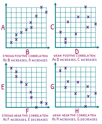
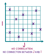
But what if you cannot draw a line of best fit. Well then there is no correlation (although you may have a non-linear relationship!)
Line of best fit
I give out this advice to all of my students, and if you are reading this I suppose you are worthy of this advice as well. Any time you see a scatter diagram, ALWAYS draw a line of best fit on it even if the question does not ask you to. Chances are you will need it!
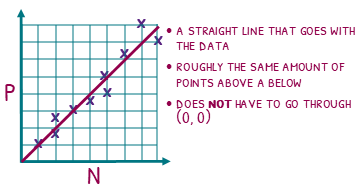
A line of best fit is a line that describes the relationship on a scatter diagram. There are a few simple rules to drawing one.
The line must go with the data.
Make sure you have a transparent ruler and rest it on top of the scatter diagram. Move it until it is lined up with the data.
There should be roughly the same amount of points above and below the line.
There is a mathematical way to find the EXACT equation of the line of best fit (but that is not assessed). For your exam you need to take a good guess at where you think the line should be. You can do this by roughly making sure there are the same amount of points above and below the line you draw.
Having said this, I had to intervene when one of my panicked students was attempting to rub hers out because there were 8 points below and only 5 above. This rules uses the word roughly because an 8-5 split is absolutely fine. In fact, the mathematical way of doing it may also have a 8-5 split depending on the relative distances each point are away from the line of best fit.
Your line does not have to pass the origin
Since most scatter diagrams only use positive measurements, I’m not sure how you can draw a negative correlation if all scatter diagrams HAD to go through (0, 0), but just remember they don’t!
Try our papers on this
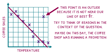
Outliers
Life is messy and there can be all sorts of things that get in the way of nice, clean data. An outlier is a point which clearly doesn’t below. It sits away from the line of best fit and can have really interesting reasons it exists.
Try to look at the context of the question and give a good reason why the outlier happened.
If we have a scatter diagram of coffee sales against the temperature, the line of best fit is showing a lovely strong negative correlation. But our outlier is showing fantastic sales on a hot day.
What could be the reason for this?
To answer this question, we have to do something that many mathematitians can find difficult. We have to speculate with our imagination. Perhaps, the coffee shop was running sale that day. Or maybe there was a music festival happening across the road.
Predictions
With scatter diagrams, there are two types of predictions, or estimates, you can make.
Interpolation
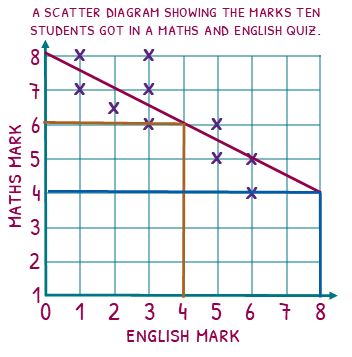
The scatter diagram shows maths and English marks in a quiz. Let’s use the line of best fit to estimate what a student would get in their maths quiz if they got 4 on their English quiz. We will start by drawing a line up from 4 until our line of best fit, then across. We can see that they would probably get 6 on the maths quiz.
This estimate is reliable because we are using the line of best fit in the part of the scatter diagram that has data around it. This is called an interpolation.
Extrapolation
Now lets use the line of best fit to estimate what a student would get in their maths quiz if they got 8 on their English quiz. We do the same steps, line up and across to find that we would estimate they will get 4 on their maths quiz.
This estimate, however, is not reliable. You can see that we only have data for students up to a mark of 6 on the English test. We do not know if this relationship continued. This is called extrapolation.
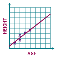
A great way of thinking about extrapolation is imagine doing a scatter diagram of age against height, but only measuring people up until they are 15. As you would imagine, the line of best fit would show the older you get, the taller you become. BUT if we keep that line going, we estimate that a 90 year-old is the height of a house! We all know that people stop growing, so the linear relationship would stop too.
Try our papers on this
The dangers of scatter diagrams
There is a saying that you need to remember when working with scatter diagrams: correlation is not causation. What this means is that you may find that the more revision guides you have, the better your maths test scores. The real reason for this link is more likely that students that revise more will have more revision books thus have better test scores.
Download Scatter diagrams Notes
(Ultimate subscription required)
